Destide@feddit.uk to Games@lemmy.worldEnglish · 1 year agoUbisofts stock tanked this morning ahead of the markets openingfeddit.ukimagemessage-square153linkfedilinkarrow-up1551arrow-down132
arrow-up1519arrow-down1imageUbisofts stock tanked this morning ahead of the markets openingfeddit.ukDestide@feddit.uk to Games@lemmy.worldEnglish · 1 year agomessage-square153linkfedilink
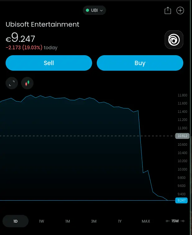
minus-squarecosmicrookie@lemmy.worldlinkfedilinkEnglisharrow-up161arrow-down6·1 year agonot really news… This is a 1 years graph… its been going downward for some time
minus-squareViking_Hippie@lemmy.worldlinkfedilinkEnglisharrow-up110arrow-down32·1 year agoRemoved by mod
minus-squareAltima NEO@lemmy.ziplinkfedilinkEnglisharrow-up12arrow-down1·edit-21 year agoRemoved by mod
minus-squareSatansMaggotyCumFart@lemmy.worldlinkfedilinkEnglisharrow-up6arrow-down2·1 year agoRemoved by mod
minus-squareShaggySnacks@lemmy.myserv.onelinkfedilinkEnglisharrow-up4arrow-down2·1 year agoRemoved by mod
minus-squareViking_Hippie@lemmy.worldlinkfedilinkEnglisharrow-up2arrow-down3·1 year agoRemoved by mod
minus-squareslazer2au@lemmy.worldlinkfedilinkEnglisharrow-up30arrow-down5·1 year agoNow do a 5 year graph and realise it’s kinda back to pre pandemic levels.
minus-squarecosmicrookie@lemmy.worldlinkfedilinkEnglisharrow-up59arrow-down1·1 year agohm… not quite… but it certainly has seen some ups and downs, that are larger than what happened this morning. This is a graph of “all time”
minus-squareIsoprenoid@programming.devlinkfedilinkEnglisharrow-up22arrow-down2·1 year agoIt would be cool if these graphs could be inflation adjusted.
minus-squareSirDerpy@lemmy.worldlinkfedilinkEnglisharrow-up14arrow-down3·1 year agoThat’s incredibly easy to do on any analysis platform.
minus-squarenonailsleft@lemm.eelinkfedilinkEnglisharrow-up16arrow-down4·1 year agoAnalysis schmanalysis
minus-squaregcheliotis@lemmy.worldlinkfedilinkEnglisharrow-up14·1 year agoThis thread is like a lesson in the importance of x and y axes range in time series plots
minus-squareCroquette@sh.itjust.workslinkfedilinkEnglisharrow-up5·1 year agoYes, but it is not acceptable in today’s capitalism. Only the growth of growth matters. If the line does not go up enough, the company is failing.
minus-squarepyre@lemmy.worldlinkfedilinkEnglisharrow-up4·1 year agothis is great. i thought they kept making slop because it’s giving them a return but I’m glad people are catching on.
minus-squareJackbyDev@programming.devlinkfedilinkEnglisharrow-up1·1 year agoThat’s a massive one day spike though


not really news… This is a 1 years graph… its been going downward for some time
Removed by mod
Removed by mod
Removed by mod
Removed by mod
Removed by mod
Removed by mod
Removed by mod
Removed by mod
Now do a 5 year graph and realise it’s kinda back to pre pandemic levels.
hm… not quite… but it certainly has seen some ups and downs, that are larger than what happened this morning. This is a graph of “all time”
It would be cool if these graphs could be inflation adjusted.
That’s incredibly easy to do on any analysis platform.
Analysis schmanalysis
WSB detected :)
This thread is like a lesson in the importance of x and y axes range in time series plots
Yes, but it is not acceptable in today’s capitalism. Only the growth of growth matters.
If the line does not go up enough, the company is failing.
this is great. i thought they kept making slop because it’s giving them a return but I’m glad people are catching on.
That’s a massive one day spike though