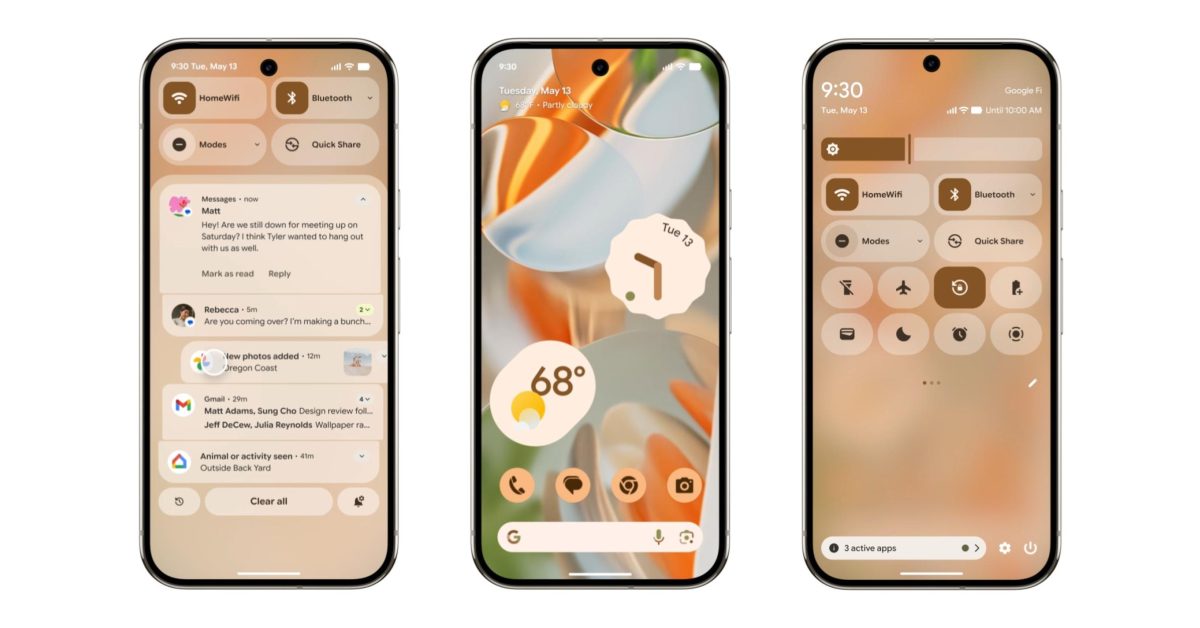
Why is the flashlight crossed out? Why do active buttons seem to have a different border radius? And what’s that circle icon that looks like a crosshair, location service? Whats wrong with the old icon? So many questionable design decisions and inconsistencies…


I got too optimistic when first heard the rumors. Nope, they’re still actively trying to build the ugliest design system possible.
spoiler
Why is the flashlight crossed out? Why do active buttons seem to have a different border radius? And what’s that circle icon that looks like a crosshair, location service? Whats wrong with the old icon? So many questionable design decisions and inconsistencies…
Your spoiler tag didn’t work for me.
Frankly I don’t see much difference from the current implementation.
The spoiler works in default lemmy ui, but I removed the angle brackets in case it throws off whatever you’re using.
And yeah, the general look is the same.
Yep that did the trick!