
Where do all the logos of this style come from? They all look so same-y and bland. I’ve seen octopi, sharks, lions, eagles, bears, etc. all in this generic youtube gamer font, with bottom-of-the-barrel ‘mascot’ designs. Anyone else tired of this?


Where do all the logos of this style come from? They all look so same-y and bland. I’ve seen octopi, sharks, lions, eagles, bears, etc. all in this generic youtube gamer font, with bottom-of-the-barrel ‘mascot’ designs. Anyone else tired of this?


I just wanted to point out that Oral B’s basic electric toothbrushes still range from $45-$80, so it’s not quite as cheap as you say it is. Your point still stands in its entirety. The only thing that makes this product different from the $45 model is the Alexa functionality, and taking that away makes it effectively not the same product.


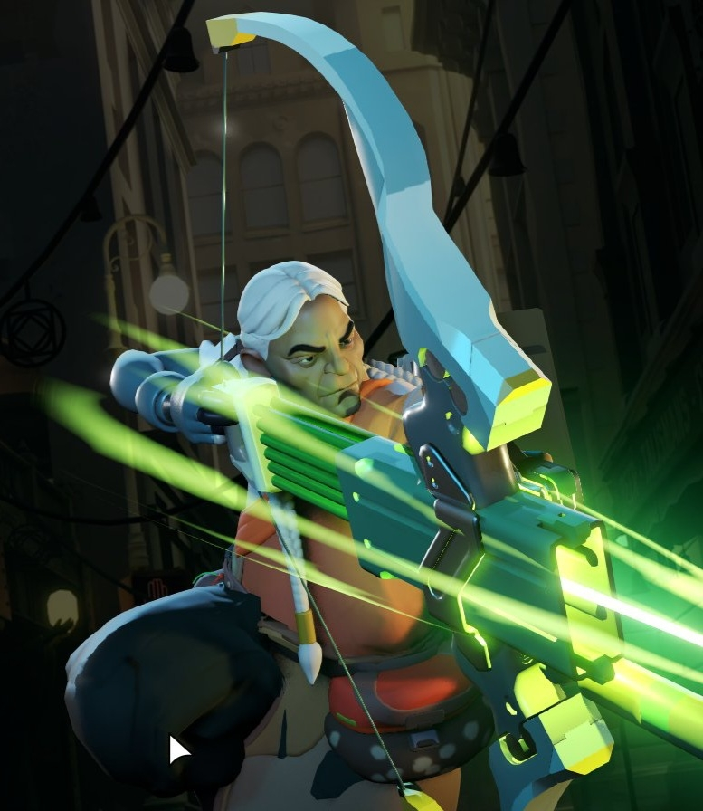
I’m not really understanding why this portrait looks this way… Is the black blob on the bottom left his bent leg? If it is his bent leg, what’s the tan colored bit at the bottom? Or is the black blob some random giant pouch on his hip, alongside the other more pouch-like object on his hip? Is the bow being held close to his body (arm bent?) or does he have a short left arm?
So many questions…


Played some Crisis Core FF7 (PSP) during down time on a road trip. I forgot how clunky the game feels, but it’s entertaining enough.
I’d like to see how the remaster compares… According to what I’ve heard, the cutscenes are upscales of the original FMVs, which are both odd and intriguing.
Interesting that the screen has such an aggressive curve, but the scanlines and text box are relatively straight.