Just a friendly reminder that there’s accessibility problems with dark themes.
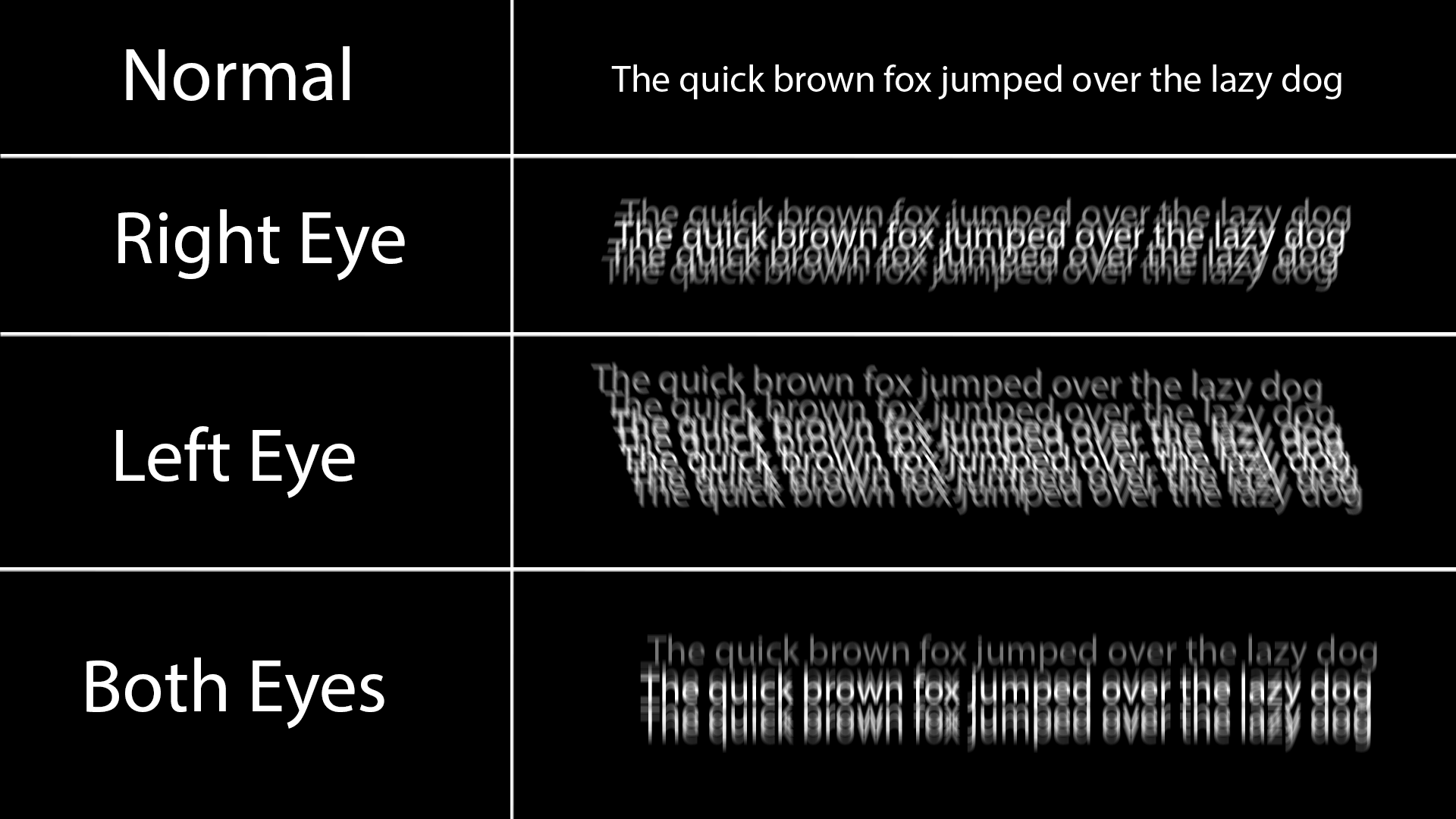
For me dark themes look like this because I have astigmatism:

Black on white doesn’t have this issue because all the white around it does is slightly blur into the black text and makes it a little grey at worst.
Any dark theme for a longer period of time also causes the white text to burn in my retina for a couple minutes, and I just see lines when I look away, and also makes reading a long article difficult and painful.
Dark themes look so much better, but keep in mind some people have very good reasons to prefer light themes. There’s no need for dark theme elitism.
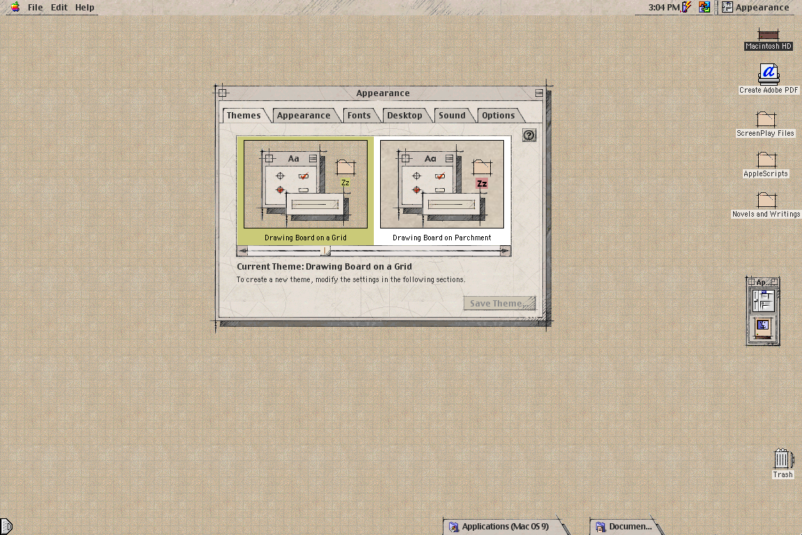
Not what you asked (Plasma theme), but my favorite UI theme since always has been MacOS Drawingboard:
https://www.appimagehub.com/p/1219916Wishing it was possible on Linux for +20 years…
If you add an “!” Before the image link it is displayed in line!

I just refuse to watch any YT video where they make a face like this in the splash image.
OP, if this video is yours, sorry, but not very.
De-arrow is a godsend for these thumbnails.
That being said, I set a “Don’t recommend channel” on Brodie Robertson because he took part in harassing a developer about some barely nsfw furry art being hidden in some software but refuses to block Nazis from his mastodon profile. It seemed like a double standard that demonstrated tolerance for said Nazis.
Fuck Nazis. Raw. With a rusty iron cactus. Dry. In the ass.
If that’s what gets you going :s
( ͡° ͜ʖ ͡°)


